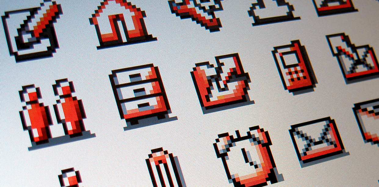
Icon design for mobile internet
Mobile UI design / Icon design
The objective of the project was to develop a set of core icons for Orange and produce icon style guidelines which would allow teams in each of Orange’s 32 territories to design icons themselves. Previously, Orange was an exclusively typographic brand and had never used icons before. The brief was to create Orange branded icons that would work on both – mobile phones at 16×16 pixels, and also much larger billboards.


